|
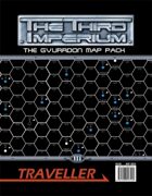
I LOVE maps. I love this map too, because it gives me some ideas on how things are spaced out and how the sector looks.
The biggest down side that i really see is that the map has a black background which makes it incredibly hard to print out. It would have been great if they had included a black text on white background also.
Also, it would have been nice if it was broken down by subsector.
Overall good product that could have done a bit more to make it more end user friendly.
|